Hi Girls!
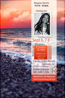
Some time ago I took a class with Jessica Sprague on Posters layouts...and finally I was able to put it in practice. Our Team of Church leaders will be having a Women Retreat and i being playing a little with some posters for the event...
In my world poster should be eye catching and right to the point..I hate when I see posters with way to much information, as they distract me way to much from the real content...
Here are two on the Posters I just created, for this 2 posters I used Elements 10 and Many Layers Masks
Cheers,
Jackie


No comments:
Post a Comment